According to the Bureau of Labor Statistics, in 2020, Computer and Information Systems Managers were the highest-paid coding professionals with a record median salary of $151,150. These Managers are considered veterans, when it comes to the soft skills of planning and organisation. The pandemic is hopefully over and now the kids are back in their classes. Yet, it has been observed around the globe that the long pandemic has devolved the soft skills of these children, especially when it comes to planning and organisation. Their attention span has receded, they show little interest in classroom activities, and most important of all, they are unable to plan out and organise tasks assigned to them in the class. Luckily, here, at Codingzen , we have a one-shot panacea for your adolescents and pre-adolescents. Our programs teach the very-valuable talent of ‘coding’, which top companies in the market are often in the hunt of, irrespective of whether they are in the software development ...
Get link
Facebook
X
Pinterest
Email
Other Apps
Data Visualization with Python
Get link
Facebook
X
Pinterest
Email
Other Apps
Using the Matplotlib module
Why Matplotlib?
It is a Python module made to visualize data graphically to:-
Get insights
Observe patterns
View co-relations visually
See outliers
And, when it comes to the best modules in python made to visualize data, two come to mind, Matplotplib and Seaborn, but the thing is, Seaborn is made on top of matplotlib itself, so there isn’t much of a difference in the logic or the working.
If you learn matplotlib, you automatically learn half of Seaborn,which is what we will do in this blog.
The most popular ways to visualize data are :-
Scatter plot diagrams
Histograms
Bar plots
We also have Pie Charts, Box Plots, Heatmaps,Stackplots, and many more…
We will take a look at the most common ones first.
Installation
For Windows:
`pip install matplotlib `
For Linux / Mac`
`pip3 install matplotlib`
And to import into a python file, just enter the following:
from matplotlib import pyplot as plt
# or
import matplotlib.pyplot as plt
Code
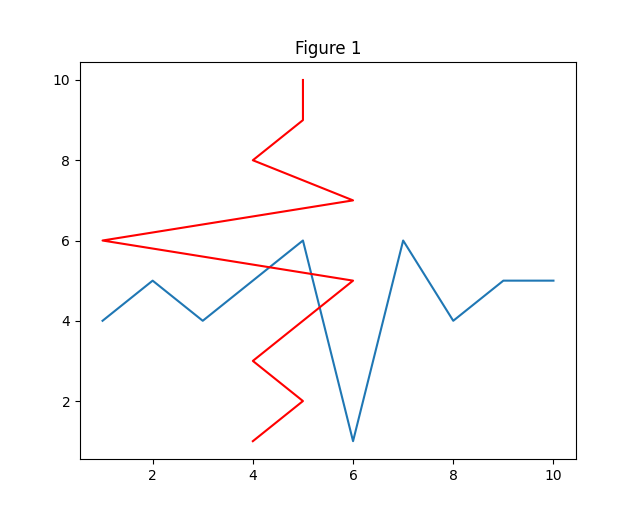
Line Plots
These are good in case you want to show some progress w.r.t. time, or draw some silly shapes, and we have many arguments we can give to change the appearance of the plot.
You can interpret y as some values of something changing over time / x for the first plot.
from matplotlib import pyplot as plt
# we simply give the x values of all the points
x_axis = [1,2,3,4,5,6,7,8,9,10]
# we do the same for y values
y_axis = [4,5,4,5,6,1,6,4,5,5]
# we can give titles to plots
plt.title(“Figure 1”)
# first we need to give the x and then y values
plt.plot(x_axis,y_axis)
# this time let’s interchange the values
# and give a new param color
plt.plot(y_axis,x_axis, color=”red”)
# finally you need to show the plot
# and yes we can show more than one plot at a time
plt.show()
Here, the color can also be custom, just write the hex code of the color.
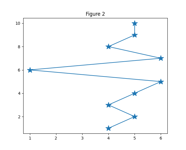
from matplotlib import pyplot as plt
x_axis = [1,2,3,4,5,6,7,8,9,10]
y_axis = [4,5,4,5,6,1,6,4,5,5]
plt.title(“Figure 2”)
# we can also control the shape and size of the intersections
# we can also change linetypes from [dotted, dashed, -, -., — .]
# and the line width
plt.show()
You can mix and match the above techniques to create something like this:
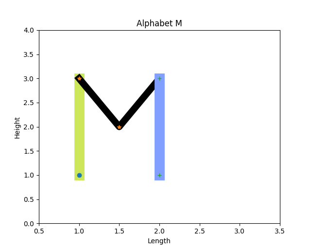
from matplotlib import pyplot as plt
# scale so the shape doesn’t expands, or contracts
plt.xlim(0.5,3.5)
plt.ylim(0,4)
# axis labels can also be given
plt.xlabel(“Length”)
plt.ylabel(“Height”)
# plot title
plt.title(“Alphabet M”)
x = [1,1]
y = [1,3]
plt.plot(x,y,color = ‘#cce85a’,lw=15)
plt.plot(x,y,’o’)
x = [1,1.5,2]
y = [3,2,3]
plt.plot(x,y,color = ‘#000000’,lw=10)
plt.plot(x,y,’*’)
x = [2,2]
y = [3,1]
plt.plot(x,y,color = ‘#809fff’,lw=15)
plt.plot(x,y,’+’)
plt.show()
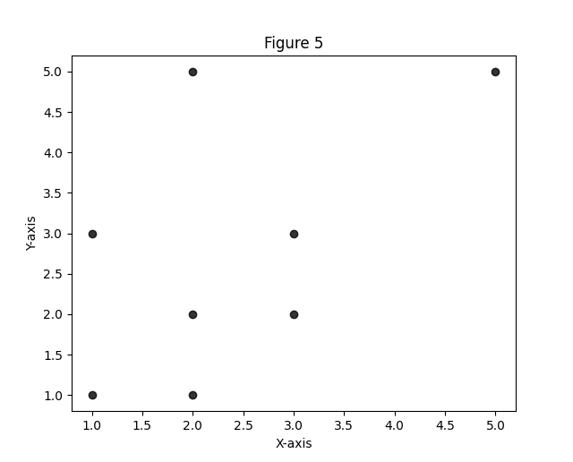
Scatter Plots
You can imagine yourself using the plot function for data that is progressive. For example, if you try to plot irregular values in both the x and y axes, we might want to plot a Scatter plot, and what I mean by those values is we want to plot the point, not the indication of 2 points being connected progressively.
The parameters are the same, leaving out the line-related ones, of course.
from matplotlib import pyplot as plt
x = [2,3,1,2,1,2,3,5]
y = [1,2,3,5,1,2,3,5]
plt.scatter(x, y,color=’black’, alpha=0.8)
plt.show()
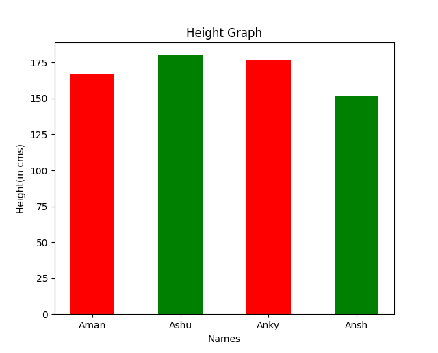
Bar Plots
These are used when you want to visualize the difference between the magnitude of different things belonging to the same group. We have labels on one axis,and any number plotted as a bar of some length on the other axis.
from matplotlib import pyplot as plt
import pandas as pd
names = [“Aman”,”Ashu”,”Anky”,”Ansh”]
heights = [167, 180, 177, 152]
plt.title(“Height Graph”)
plt.xlabel(“Names”)
plt.ylabel(“Height(in cms)”)
# first we need to pass in the labels and the values
# then the gap between the bars in percent
plt.bar(names, heights, 0.5, color=[“red”,”green”])
plt.show()
We can also switch the axes to make the bars horizontal and labels on the y-axis by using the barh function and instead, the parameters stay the same.
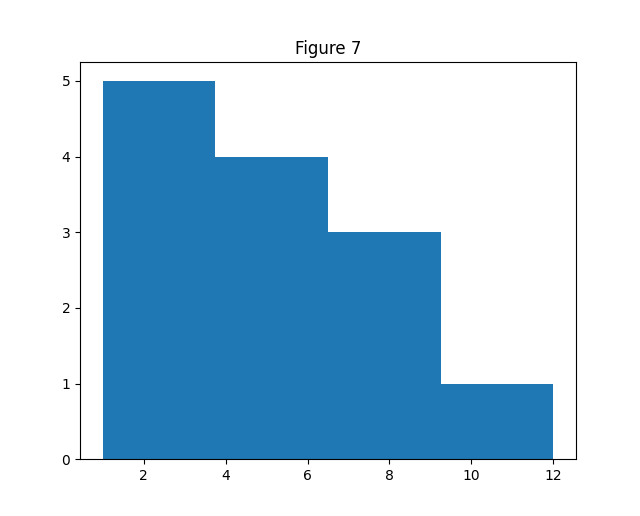
Histograms
When you want to see how data is distributed among a field, specifically the data frequencies separated on different ranges.
from matplotlib import pyplot as plt
import pandas as pd
# data = pd.read_csv(“../houses.csv”)
# data = data.dropna(axis=0)
# x = data[“total_sqft”]
x = [2,1,4,5,7,9,2,3,3,6,8,4,12]
# here bins parameter decides how many partitions are we going to do of our histogram
plt.hist(x,bins=4)
# now as the max value in x is 12, and bins is 4, so the 4 bars will display the frequencies from 1–3,4–6,7–9,10–12
plt.show()
To get custom ranges, we can pass in a list of the ranges in bins instead
E.g., to achieve the same, we will put bins = [1,3,6,9,12]
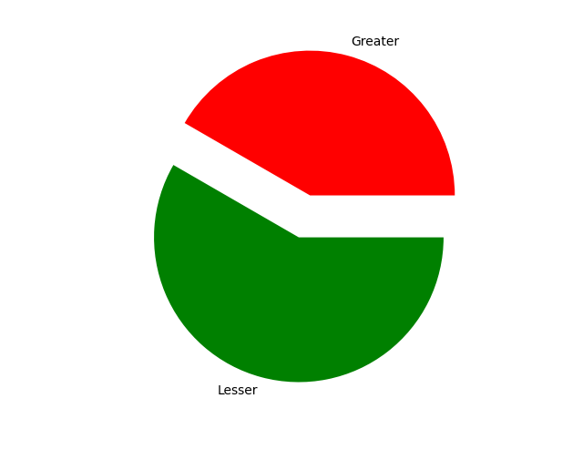
Pie Charts
When you want to compare ratios of a field, or simply look at the weighing of data.
We still have many different types of graphs we can plot, but the introduction of the most popular way of data representation is complete.
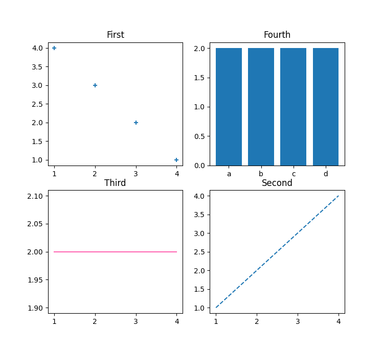
Subplots
You can plot multiple plots as part of the same plot, using something called a subplot, first you need to describe the shape of the canvas and then the positioning of the specific subplots on that canvas.
The subplots can be of different types.
from matplotlib import pyplot as plt
x = [1,2,3,4]
y = [4,3,2,1]
z = [2]*4
# the shape we’ll pass in is 2,2 so the sublots will be structured like:
# [
# [[1],[2]],
# [[3],[4]]
# ]
plt.subplot(2,2,1)
plt.title(“First”)
plt.plot(x,y)
plt.subplot(2,2,4)
plt.title(“Second”)
plt.plot(x,x, linestyle=”dashed”)
plt.subplot(2,2,3)
plt.title(“Third”)
plt.plot(x,z, color=”hotpink”)
plt.subplot(2,2,2)
plt.title(“Fourth”)
plt.plot(z,z,marker=”*”)
plt.show()
Conclusion
Matplotlib is a great tool depending on how much effort you are ready to put into work.
We learned how to create all the basic graphs, line plots, scatter plots, bar plots, histograms, pie charts and had an intuition of where we might prefer one over the other.
You are free to go and mix and match the function arguments and different graphs on the subplots, try out different values and labels.
In this developing era coding has turned out to be one of the most important skills that one should develop. A proper understanding of the technology is required to compete in the present and future. Kids get digital knowledge and they can even achieve academic success with coding . Coding helps kids in mathematics and develops writing skills. Kids even develop sharper cognitive skills which help them to solve real-world problems. Coding develops logical and creative skills as it is all about trial and error methods. Kids tend to be stubborn but coding teaches them patience as kids need to try again and again after every failure while coding. It provides an opportunity to learn from your mistakes . Coding is beneficial for kids but how inspire kids to learn to code ? ESSAY ON PROGRAMMING The ideal way to introduce your kids to something new is by researching it together. If they are unaware of the topic then you should start with a small project regarding the topic. You can ask their ...
Peter M. Brant has very well said “Art and science have so much in common- the process of trial and error, finding something new and innovative, and to experiment and succeed in a breakthrough” . The statement by Peter stands relevant today as creativity through arts and innovation through science is a deadly combination. To be good at one means to be good at the other. In today’s time, STEM and Arts cannot be stretched apart far. Parents usually realize the importance of STEM, for developing cognitive skills in their kids as well as prepare them for a better future but they tend to forget about developing their creative side as well which comes from the education of music and arts. This creative development is necessary for the kids to succeed in the future economy. Teaching kids an additional musical instrument helps in developing a higher IQ, creativity, verbal ability and non-verbal reasoning as learning something to relax, soothes one’s mind and body which is very well stated by ...
The global pandemic will leave this world in a different place than before March 2020. The impact will be seen on all of us economically, on a personal basis and our health in the coming years. Like a coin has two sides. Similarly, it has changed how education is carried out, as many companies have realised that it isn’t required to call the employees from around the world to conduct the business as one can smoothly do it over Zoom. Similarly, kids are now learning through online coding classes for kids through the work-from-home model to avoid infections and ensure no overcrowding in the classroom. Unfortunately, attendance at the school will be affected because of the frequent waves of infection. Many kids have realized the value of remote learning during this period in a positive way. Veronique Mintz, an eighth-grader had laid a convincing argument in an op-ed this week in The New York Times as “Why I’m Learning More with Distance Learning than I Do in School?” A simple fact to ba...


Comments
Post a Comment